by Derek Gabryszak
In January, Oscilloscope Laboratories got in touch to ask if I would be interested in experimenting with them on a poster for an upcoming film.
The experiment would take the form of an unorthodox approach to designing the key art for Jill Magid’s art world documentary, THE PROPOSAL. It started with a creative brief consisting solely of 12 keywords that O-Scope and Magid fed to me. I was not to see the movie, or read anything further about it. In fact, at this stage, I knew nothing beyond the film’s title.
It’s a weird idea, and exactly the kind of challenge that fires me up. Hell yeah, I was interested! I also trusted them based on their track record of really interesting films and key art to match…they had much more to lose on an experiment like this than I did.
So, I didn’t see the film. I didn’t know what it was about. I knew the director was an artist, but didn’t research her. I didn’t do any googling to try to figure things out…I put my trust in the experiement.
First, their list of keywords:
- PANTONE 214-C
- INACCESSIBILITY
- FRUSTRATION
- CORRESPONDENCE
- MEXICO
- DIAMOND
- DEATH
- LEGACY
- GHOST
- LOVE TRIANGLE
- LUIS BARRAGÁN (ARCHITECTURE)
Some of the clues had specific visual associations even if not literal…the Pantone, Mexico, diamond, death, correspondence, ghost, triangle, and of course Barragán. The trickier ones to communicate were inaccessibility, frustration, and legacy. I didn’t hit every theme in any of them. At best, I think I was hitting 5 or 6 notes across each poster.
Here, a resulting selection of images from Round 1:
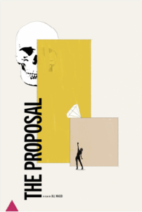
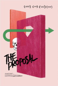
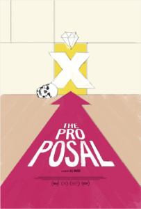
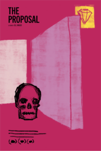
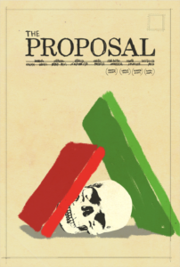
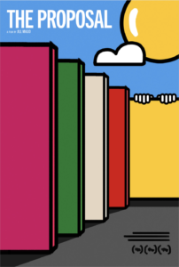
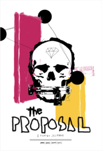
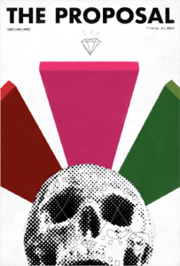


Luis Barragán was the strongest theme aesthetically and thematically. Barragán was the most specific thing on the list, so I really leaned on that throughout the entirety of Round 1. I may have even decided that the documentary was about him somehow.
Comps 1 and 2 felt to me the most interesting. I enjoyed the playfulness in scale on the first, and the fact that the second could be looking into a grave, but adopting the style of Luis Barragán’s own work. That, to me, was a fun pairing of Barragán and death.
It was after I’d sent that round that they sent me a link to watch the film. I did, and to my surprise, some of the concepts really applied. That was crazy to me…like I was the prop in a magic trick or something.
Jill had also started sending me every piece of correspondence she’d had with the antagonist in her story. Looking through Jill’s notes was incredible. I’ve never gotten that kind of access to the heart of a story before. It was almost too much…like reading someone’s diary. I began to feel part of the story that was being told at this point.
They expressed interest in a number of looks and gave me some notes, and after all this new information, I had some ideas too.
Here, a selection of images from Round 2:
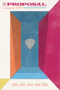
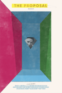
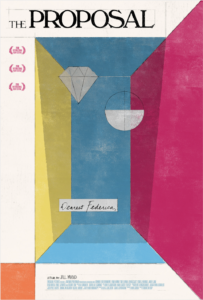
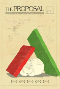
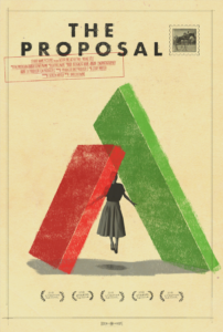
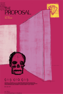
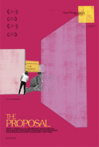
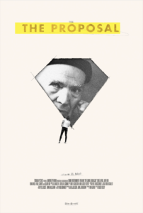


The next round further developed some of the things we got right in round 1. We tried adding some themes that were lacking or needed refining. I made title treatments that referenced type within the film. Some of Jill’s work references Charles and Ray Eames’ Day of the Dead film, so that was fun to pull from. And certainly, Jill’s handwriting, and the sketching/drafting aesthetic in general.
Continuing to work some of these ideas out really made the stronger ones stand out. Specifically 10-12, and 16-18.
We were on to something, but we had also defined a new problem. We’d need to incorporate a visual of the antagonist, whose likeness is hidden from us in the film. How do we do that?
So, after a bit of further development…
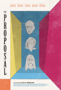
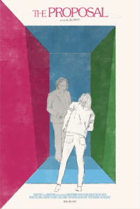
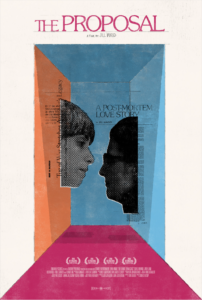
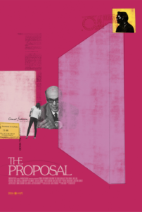
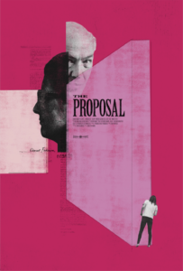
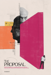


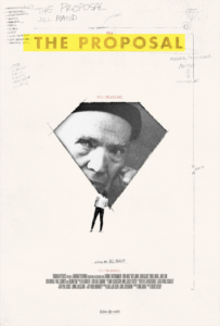
Some of these felt really nice. I had to stretch to find ways to get additional narratives in while maintaining coherency. But we all ultimately kept looking back at the image of Jill, small, peering in to the diamond-shaped image of Barragán.
That concept hit each of the notes we were searching for…Jill was peeking in at Barragán, captured with the confines of a diamond. She was somewhere else, in full color to Barragán’s black and white. Her posture denotes her searching for something…It was a lot of narrative contained in relatively minimal information.
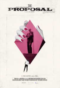
We still needed that other protagonist. But where does Federica fit in…is she with Barragán? …is she with Jill? …is she somewhere (or something) else entirely…?
I’m a sucker for an image of a large, overpowering hand. There’s such power in it. It’s strong, bold, and ominous. That’s Federica’s image. The whole story is in her hand.
After some additional development…

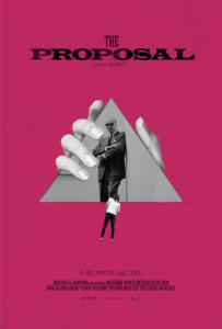
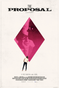
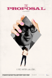
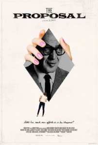

This experiment was certainly a scenic route in design. Looking at the finished result, it’s interesting to see how much (or little!) of the original concept remains. But the destination is not the journey, and at the end of the day, the process itself served to force each of us to think in new ways. To see the themes in new ways. And to receive information in new ways. It was an awesome ride, and one that very much feels akin to Jill’s extraordinary journey that is documented in THE PROPOSAL. I hope you have a chance to see the film.

Derek Gabryszak is a graphic designer based in Brooklyn. Find his stuff at www.thewayitgoes.com or on Instagram.

